


The Client
Holini is a Premier Google Partner agency based in Estonia that helps international companies drive continuous business growth through data-driven marketing implemented by senior-level specialists only.
The Goal
Portray Holini as the professional, trustworthy, and yet friendly agency they are to their potential customers and investors by creating custom designs based on their company values.
The Deliverables
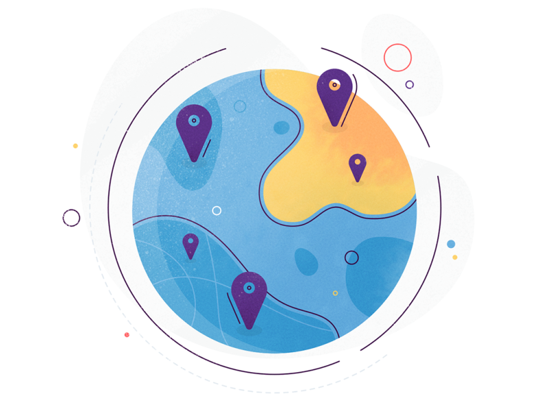
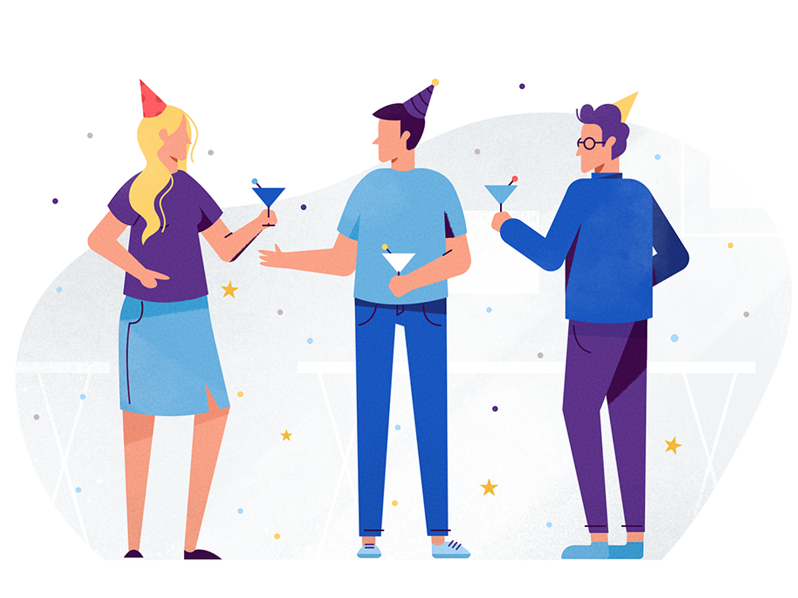
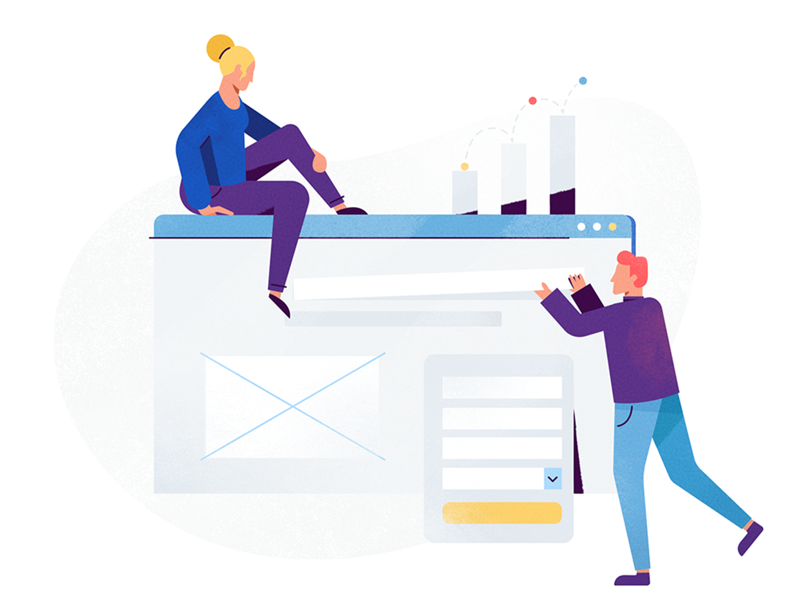
• 9 unique Illustrations
• 27 fresh Icons
• 1 online Pitch Deck Presentation
• 1 live Pitch Deck Presentation
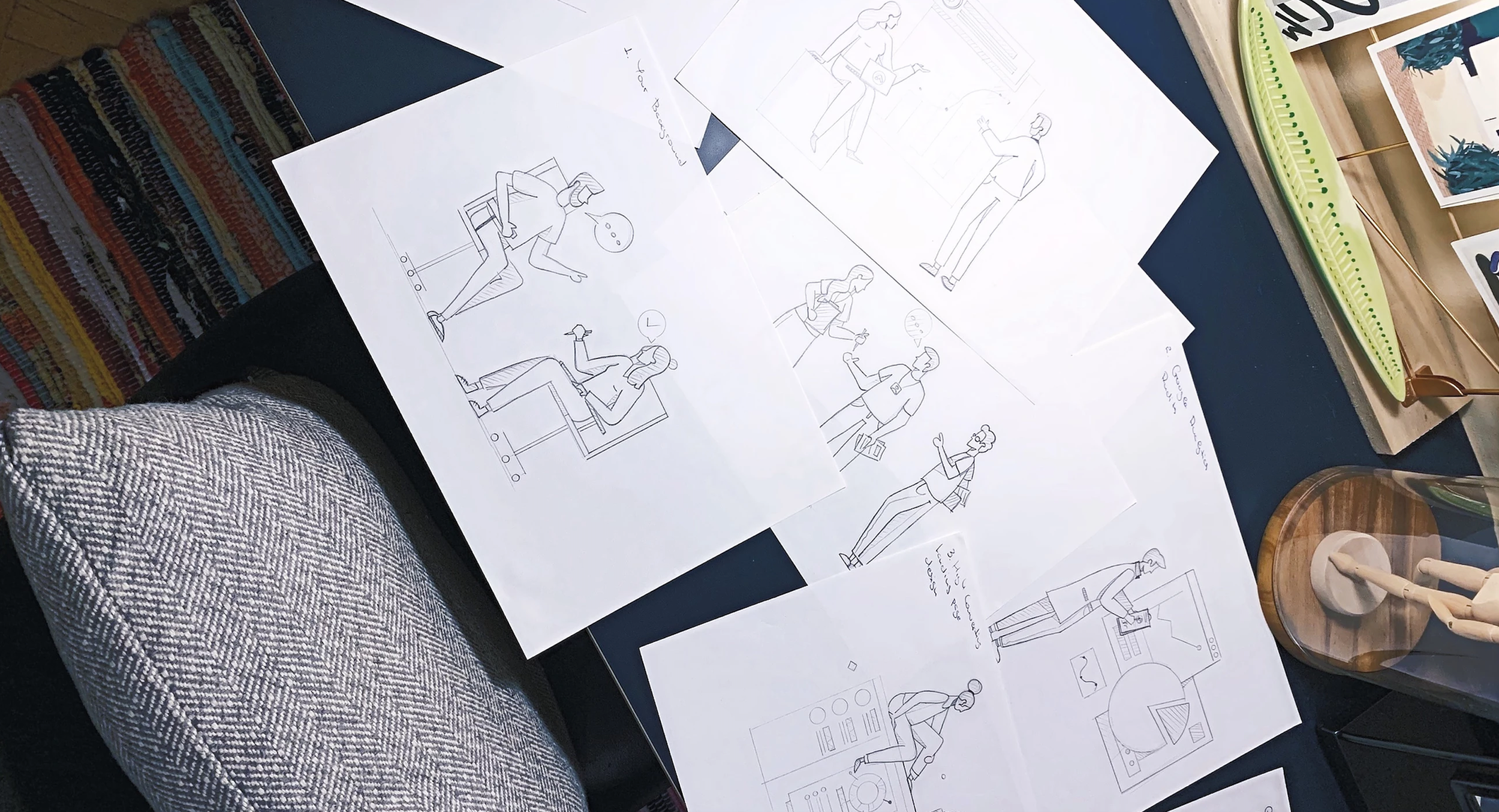
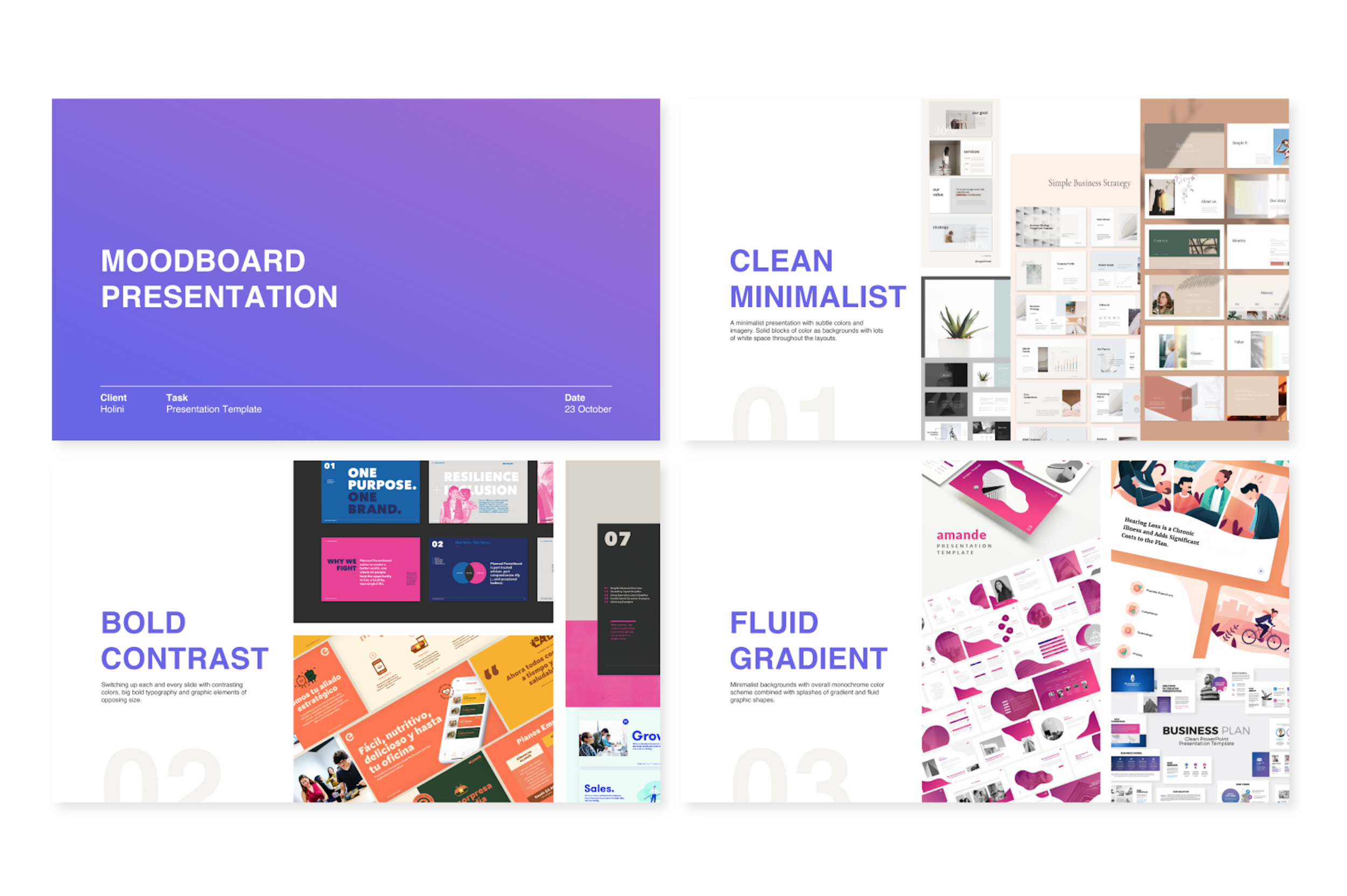
Warming Up
I kicked off the design process by creating a custom mood board showcasing a collection of visual samples that nailed the client's preferences.
Through discussion and acquainted research, we found out that minimalism & geometry perfectly represented the criteria of professionalism and trustworthiness.
Combining those elements with a few custom textures, the hint of friendliness and warmth was also successfully added to the mixture.
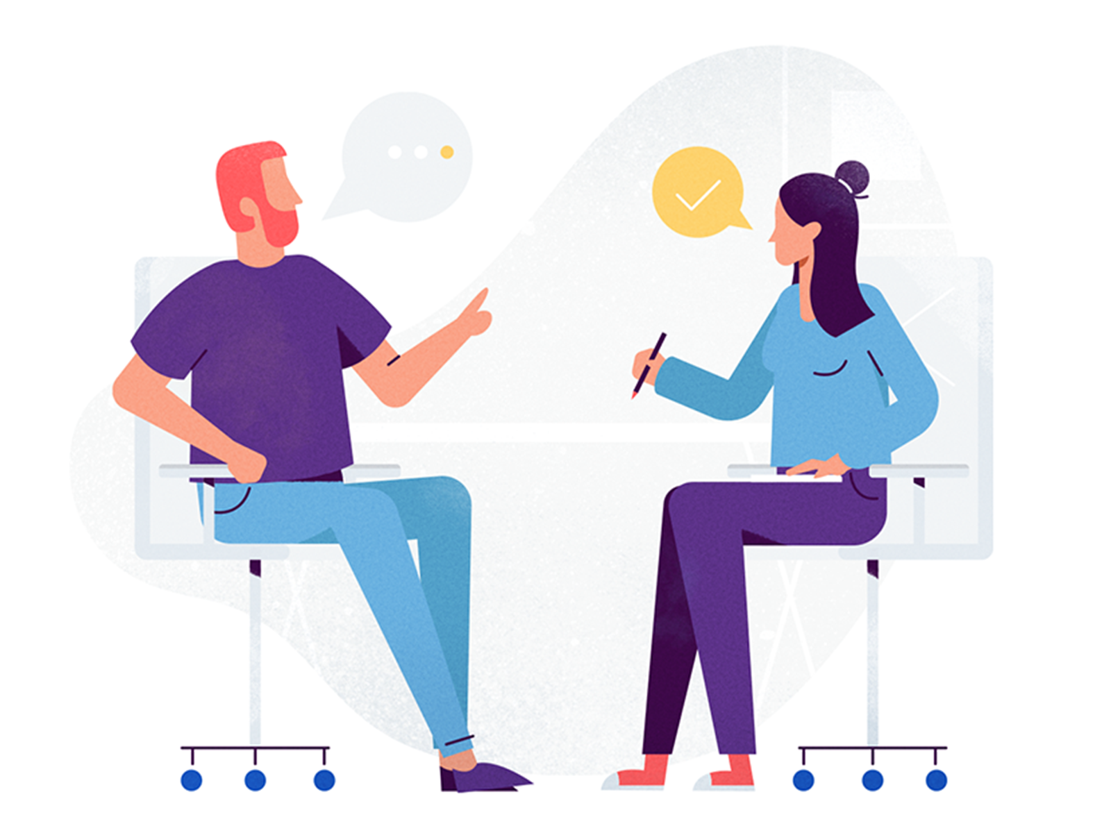
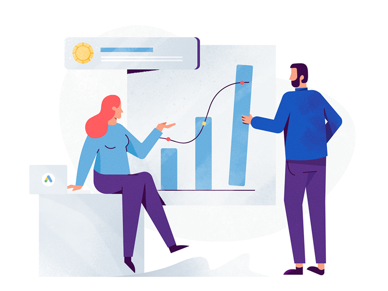
Illustrations & Icons
Without that many iterations in mind, the client was content with this direction and gave me the green light to digitalize the images. We explored two different color options based on the preexisting Holini branding- one evenly balancing the warm and cold shades in a more playful way and the other emphasizing heavily on the colder tones of the palette.
We went for the second option that consisted mainly of blues/greys & purples thus eluding seriousness and reliability. The playful, friendly factor being a secondary objective was implemented as vibrant pops of accent color.
Color Exploration
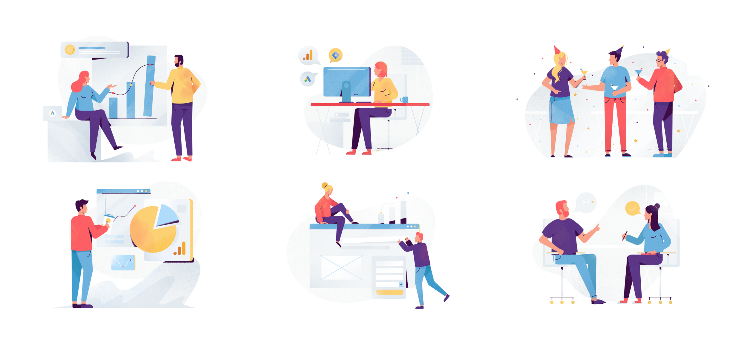
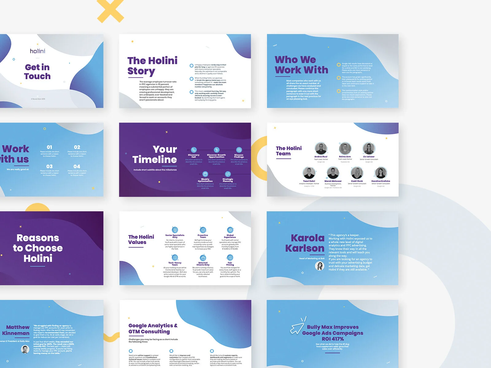
Final Deliverables


Pitch Deck
After nailing down the visual elements and color palette balance, we continued to design a Pitch Deck aimed at Holini’s potential customers and investors.
I presented the client with three different creative directions for the Pitch Deck, each of which had distinctive characteristics that could perfectly work for their brand.
They resonated with all examples and decided to create a unique combination of all of them.
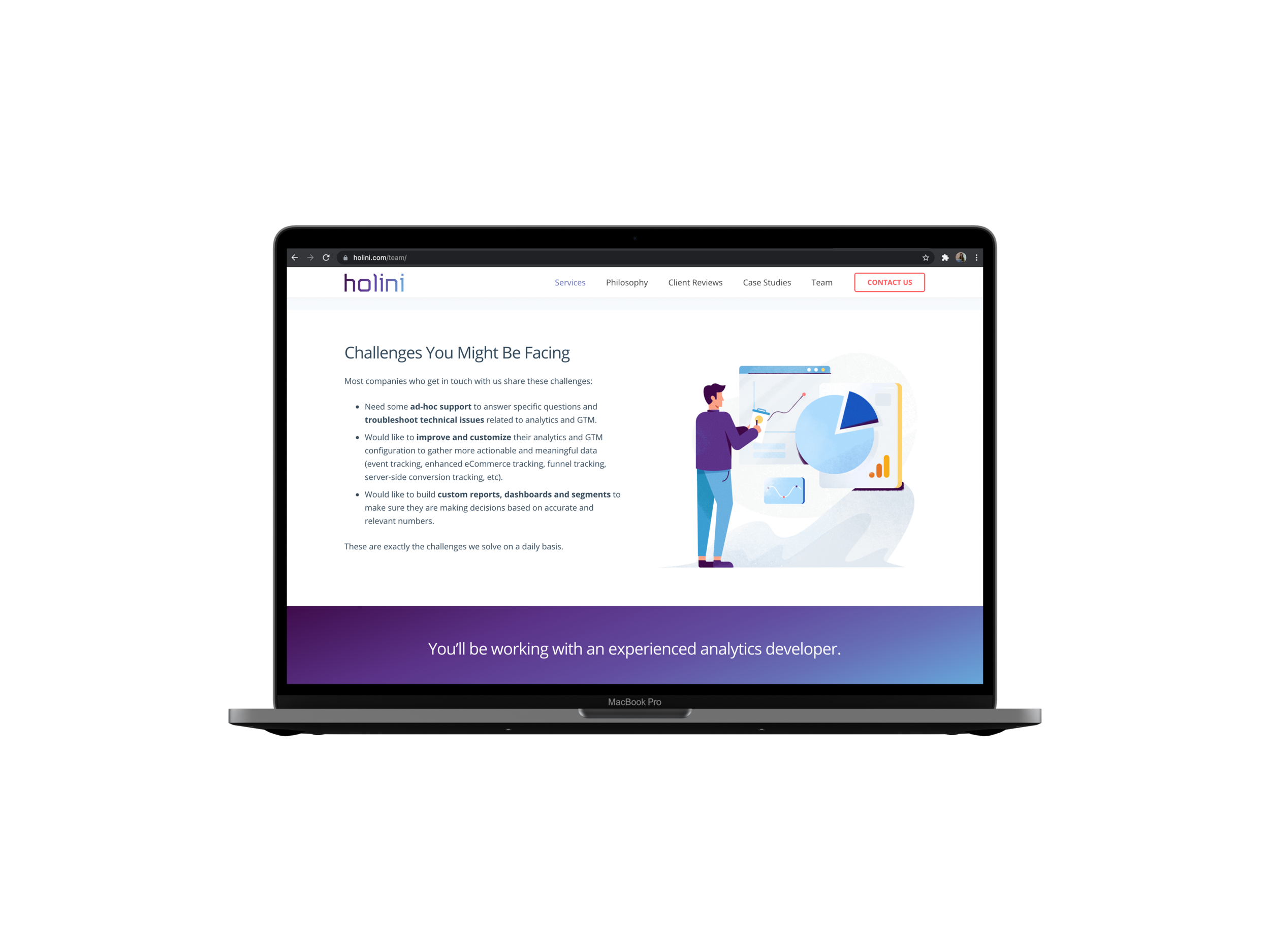
The Problem
Holini had a lot of information to share and was looking for a single presentation that would include a large body copy of work for their online and live audience. Live presentations bearing lots of text tend to be inefficient since the audience cannot simultaneously concentrate on listening to what the speaker is saying and reading the information on the screen. Legibility also is strongly compromised when cramming lots of information onto a projected screen with questionable resolution.
The Solution
Persuade Holini to do two versions of the same presentation:
A detailed text-heavy Deck that would be sent via email and would be aimed at potential offline readers. There need for transitions or animation would be obsolete in this scenario.
An extremely simplified Deck meant to be a supportive tool for the speaker who would be presenting at online conferences and live events. This presentation would be carrying the bare minimum of text, using large typography and subtle transitions and animations.
I managed to show Holini that the one-size-fits-all approach might drive away their potential investors so we created two versions of the same presentation. Below you can see screens of the detailed, read-only final version:
"Having worked with Mila on several projects, I can say that she's always very professional, delivers quickly, and brings up fresh ideas and suggestions for the needed designs. I will definitely be working with her again in the future if she's still available."
— Marek Meiesaar
Business Development, Partner
Holini