
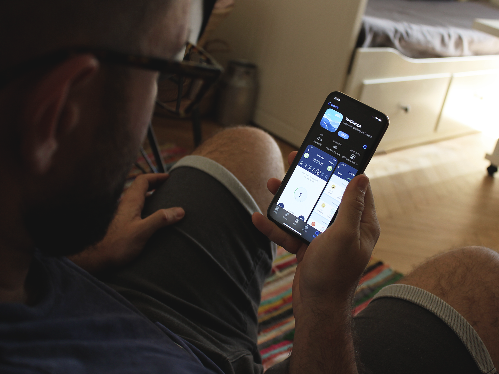
App Icon Design for VetChange
I joined forces with Vertical: a studio based in Berkeley, California. Together we worked on this project owned and developed by the U.S. Department of Veterans Affairs and created one expressive icon to represent VetChange on the market.
-
Who Is The App For?
VetChange is intended for Veterans and Servicemembers who are concerned about their drinking, how it relates to PTSD, and for all people who are interested in developing healthier behaviors.
-
What Does It Do?
The app provides tools for cutting down or quitting drinking & managing stress symptoms, education about alcohol use, how it relates to PTSD, and guidance to find professional treatment.
-
What Are The Main Challenges?
Come up with a discreet and mindful way to introduce the app without using any imagery that might make the user feel anxious or exposed for having installed it on their mobile device.
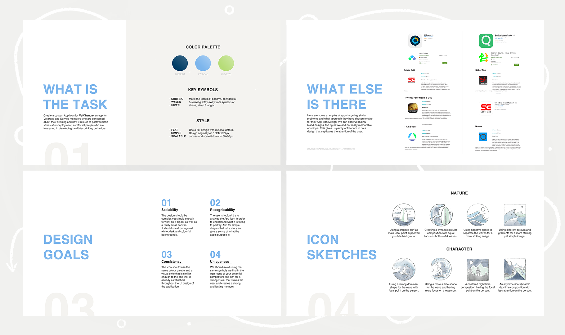
Research, Objectives & Sketching
I began my process by researching whether there are other similar apps on the market, what they are doing right or wrong. The competitive examples I found didn’t put much effort into coming up with a meaningful or functional design which gave us plenty of opportunities to distinguish Vet Change on the market.
Following was a brainstorming session on what kind of imagery would fit the carefully outlined criteria of mindfulness and discreetness. I sketched eight ideas: four of them focusing on the representation of expressive waves that were a concealed metaphor for the user’s struggles and goals. The other four were portraying a gender-neutral character embarking on a journey in different settings.
Eventually, we concluded that we should avoid putting the user on the spot by using a character as our focal point. We further developed the wave idea as it would be subtle enough yet still meaningful for the person using the app.
Let’s Do This
I digitalized the two favorite sketches and experimented with their color hierarchy and levels of detail by continuously going back and forth to test how they look on a mobile device. Vertical already had a prepared and approved color palette of just three colors to work with, so I had to figure out a way to find the right balance between the blues and greens.
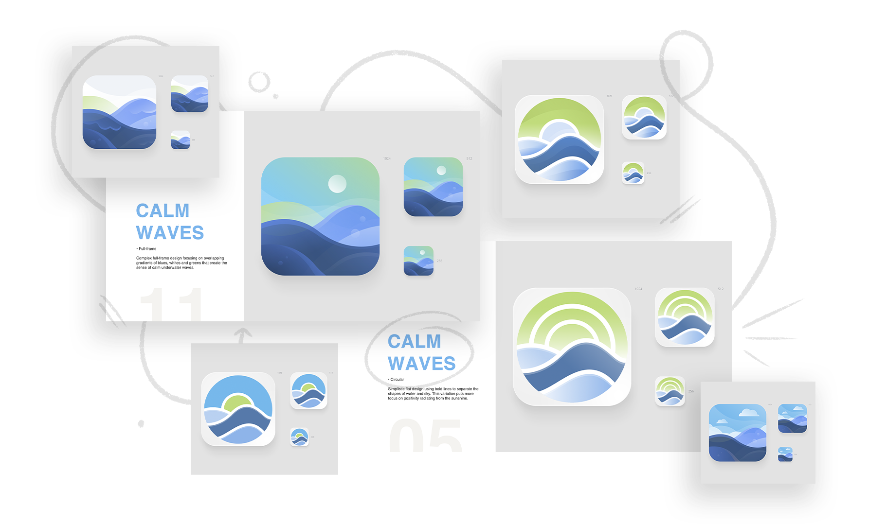
Narrowing Down The Choice
We started eliminating the variations one by one, and eventually, we narrowed down the selection to just three alternatives. They were emphasizing the water without the sun being so heavily present in the middle of the composition.
The client had only one iteration they wanted me to apply before continuing to the next step. I had to add foam onto the waves to make the illustration more dynamic. We explored three differently cropped alternatives of each icon that were accentuating different parts of the composition.
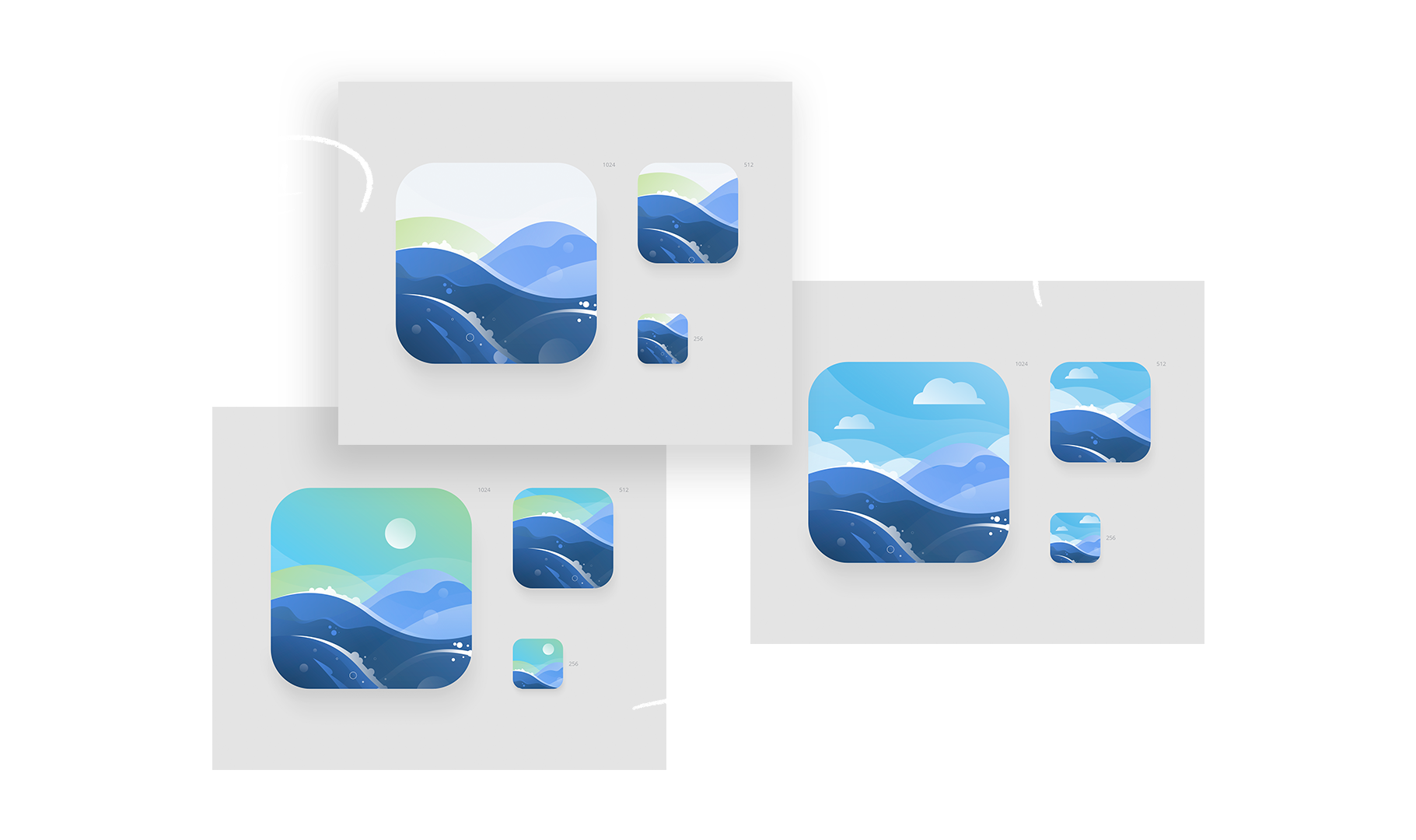
The Winner 🌟
Marking the end of this project, VA decided to go for the icon accentuating the blue sky and waves as their final choice:

“Mila is a great illustrator and a fantastic professional. She’s been able to understand the client’s needs and always delivers beautiful, meaningful material. She’s responsive, on time and collaborative. A great asset for my company.“
— Giovanni Moraja
CEO
Vertical